Ok... That there cover below was a bit of a dog, but I did like how it came together. Frank gave me the go-ahead to start the series and I struggled with an image for quite a bit. Finally, I did decide and ink the thing up, using a lot of open areas which I figured I would render out with color. This isn't how I usually go but I was so impressed with some of the things that I had seen around (mainly in Adam Hughes' work!) that I figured I'd give this a shot.
There's a big sloppy layer from another painting that I shot and dropped in, semi-translucent. Just shapes and bumps, etc. I began erasing highlights once the main color was done and was digging the organic effect that we were getting with it. Sometimes my computer colors seem to me to be kinda dead you know. This was a nice remedy...
Subscribe to:
Post Comments (Atom)

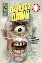


I've always felt that giving a picture texture ADDs that something that most flat drawings lose once it's cleaned. A good pencil drawing is something that is seen as not full or done, but I love a rough drawing here and there rather then something that's too clean. The cover looks great it's just the right amount of negative space for the title and characters to get people into wanting this comic for a long time coming.
ReplyDelete