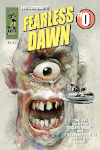


Some examples of different Mannion styles here. I think I'm moving a bit more towards the realistic lately. The one cartoony page from the Bomb was dropped and replaced by the "Spirit" swipe which is still one of my faves. The tight ad at the bottom was a thrill to do.


I like the real, but I'd love to see the mix. The combination is something of a throw back to the great Jack Cole. I'm a self proclaimed Cartoonist, so I'll side with the other side of things each time. All in all your style of things is amazing in either case, so flip a coin or see the letter page after making a comic one way then the other. Again I'd read both even if it was the same tale.
ReplyDeleteThat's the nice thing about your comics, you don't just get one style. Your art accentuates the mood of the scene. If the mood is campy or silly, you get cartoony. If the mood is serious or action-y, you get more detailed. If the mood is sexy, then who-eee... look out!
ReplyDeleteSome of your drawings, like the 3rd one here have a really soft shady look. Do you leave the pencils in your scans? Is that your secret? Tell me
ReplyDeleteThanks guys. KW-Yes I think there's a lot of pencil in that one and also a 72 dpi scan adds something if you ask me...
ReplyDelete